Financial Services · Mobile · 2022
Accorn
Reduced the core flow to 3 taps. Trust over usability.
View clickable prototype ↗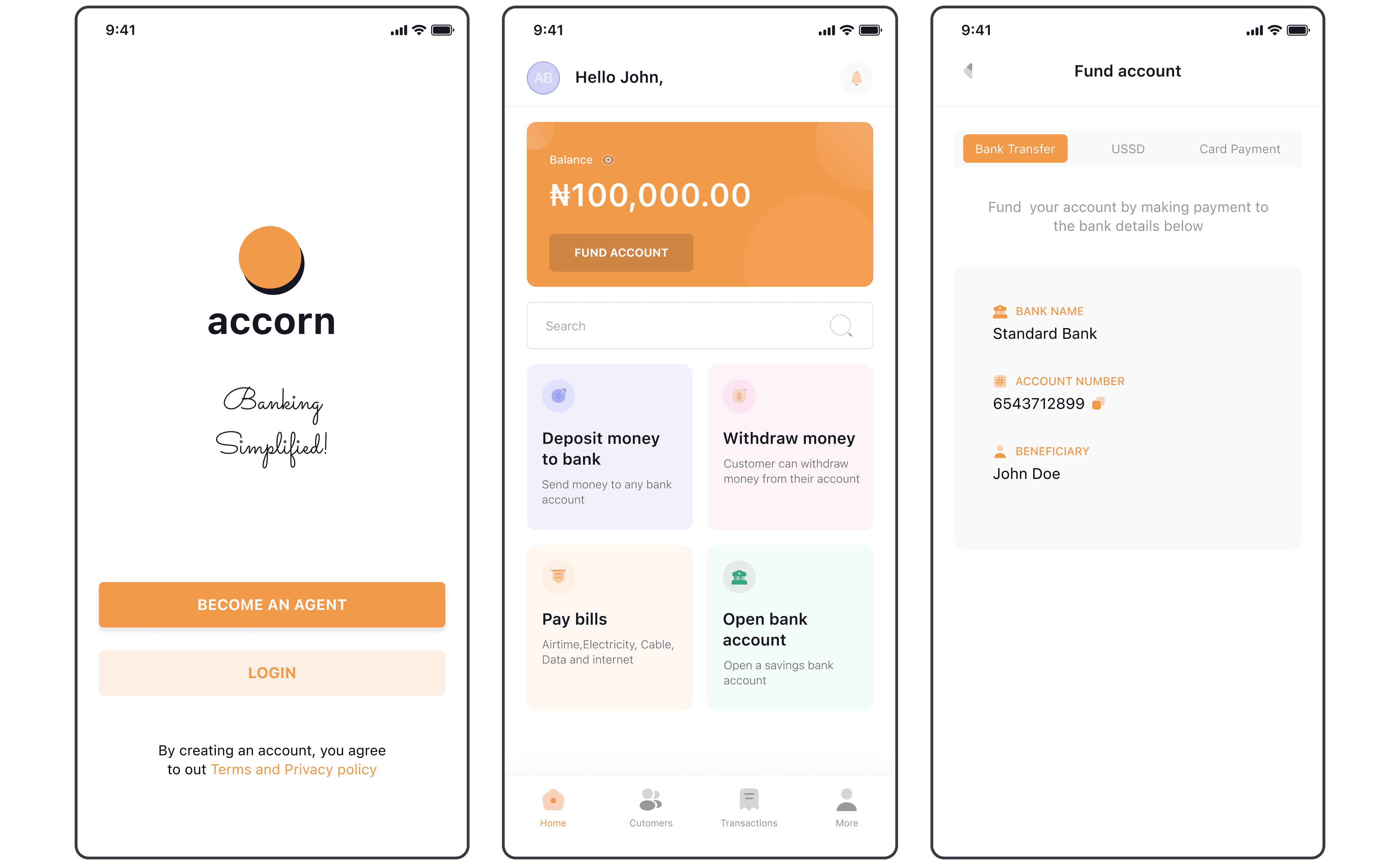
Role
Product Design · Research
Year
2022
Outcome
35% of unreachable merchants, reached
Read
4 min read
Over 106 million Nigerians, 36% of the adult population, have no access to formal banking. I spent three months embedded in rural communities to understand why, then designed the agent banking app that would become their first point of financial access.
The insight that changed everything: you don't design for the end user. You design for the trusted person in the village who already handles their money.
My Role
UX Designer and Product Researcher. I conducted three months of immersive fieldwork in rural Nigeria, led the ideation and design process, and created the agent-centric model. I was the sole designer, working with 1 PM and 3 engineers.
Team
1 designer, 1 PM, 3 engineers
Timeline
5 months (3 months research, 2 months design)
Tools
Figma, pen & paper, field interviews
02
The Problem on the Ground
I didn't start with desk research. I went to rural communities across eight states and spent three months living alongside the people we were designing for. What I found was more nuanced than any brief could capture:
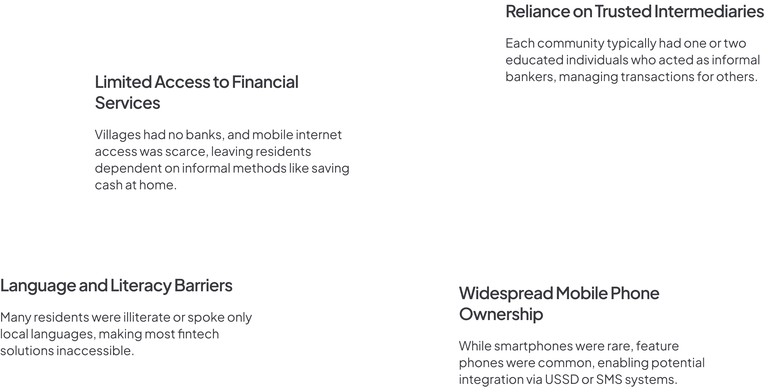
No infrastructure
No banks, no ATMs, no reliable internet. People traveled hours to access basic financial services.
Trust was local, not institutional
Villagers trusted the person who ran the local cooperative, not a bank logo on a screen. Past experiences with hidden fees and poor service had destroyed institutional trust.
Literacy was a real barrier
Many users couldn't read English or even their local language in written form. Icons, colors, and spatial patterns had to carry the entire interface.
Informal economies were sophisticated
The "unbanked" weren't financially inactive, they saved, lent, and transacted billions annually through informal cooperatives. They didn't need to learn banking. Banking needed to learn them.
“I stopped designing for 106 million unbanked Nigerians and started designing for the one trusted person in each village who could be their bridge to formal finance.”
04
The Business Case
Nigeria's informal economy represented billions in untapped financial services revenue. With 772 local government areas, even modest penetration meant massive scale.

Transaction fees
Revenue from deposits, withdrawals, bill payments, and transfers through agents.
Microloans
Credit services for rural entrepreneurs and farmers, interest income while driving economic activity.
Government partnerships
Welfare disbursement channels for government-to-person payments.
Agent incentives
Revenue-sharing model that made agents financially motivated to grow their customer base.
Projected first-year revenue: $5M from agents in 100 local government areas across eight states.
05
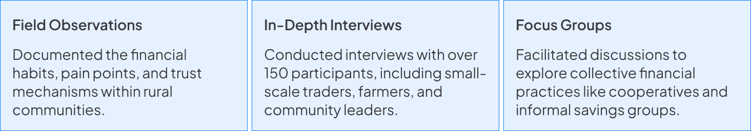
Research Methodology
Three months of immersive fieldwork. I didn't send surveys, I sat in village squares, watched transactions happen, and asked people to walk me through how they managed money.
06
Key Findings
07
The Agent Model
Instead of targeting end-users directly, I designed for community agents, trusted individuals with smartphones and basic digital skills. They would be the interface between the banking system and the community.

This wasn't a compromise. It was the architecture. Agents already handled money in these communities. I was giving them better tools, not replacing them.
08
What I Tried and Killed
My first design included a user-facing mode, a simplified screen that agents could hand to customers for self-service. In testing, it failed completely. Users were uncomfortable holding the agent's phone. They wanted the agent to do it while they watched.
I killed the customer-facing mode and redesigned the entire flow as agent-operated with visual confirmation screens that customers could see and verify. Trust increased. Errors dropped to near-zero.
09
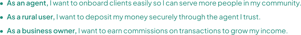
User Stories & Journey
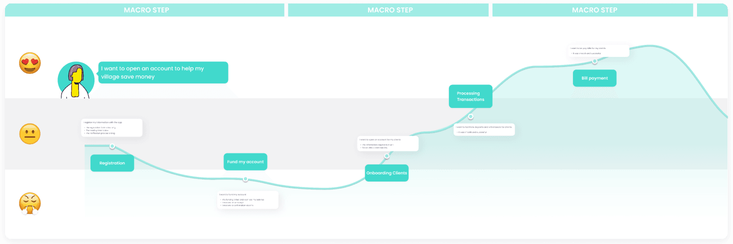
10
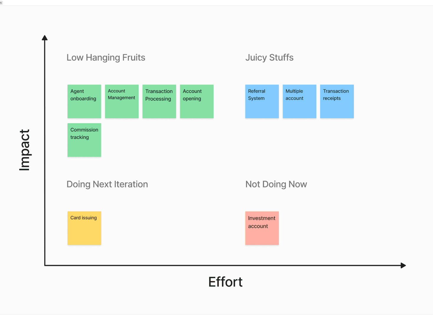
Feature Prioritization
Every feature was evaluated against one question: does this work when the internet drops? Offline-first was the architecture, not a feature. I cut real-time notifications, location tracking, and video onboarding, all of which required connectivity.
11
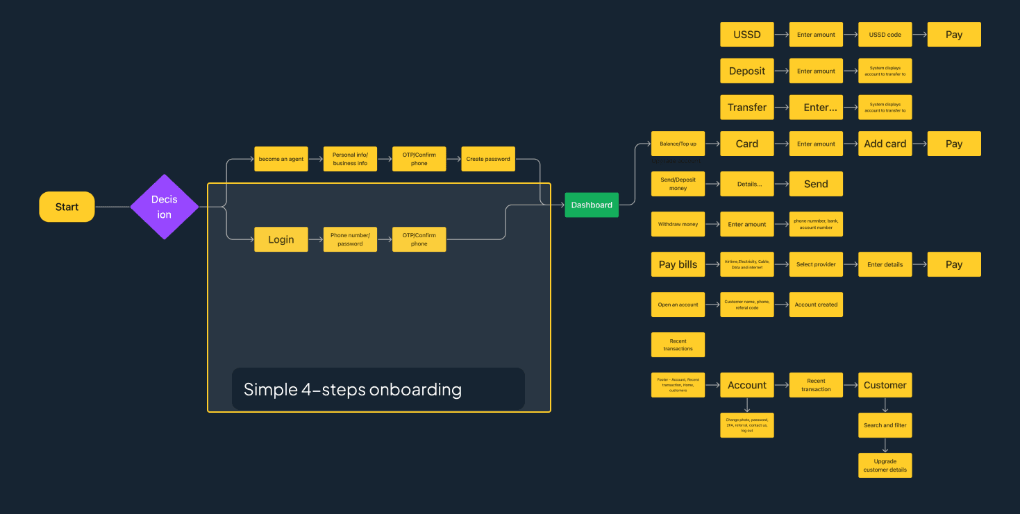
User Flow
12
Sketches & Wireframes
Pen-and-paper first, tested with actual agents in the field. Two rounds of iteration before any screen hit Figma.
13
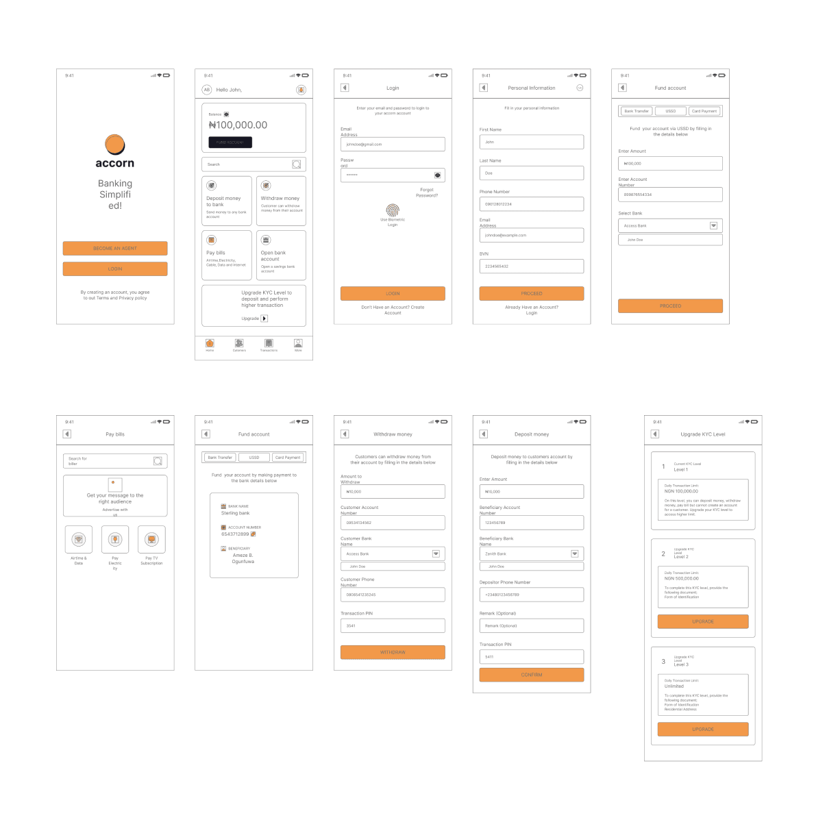
Final Designs
Three taps for any core action. Color-coded transaction types. Large touch targets. Offline-first with clear sync indicators. Commission dashboard that agents checked hourly, it was their primary motivator.
14
Validation
Tested with agents and rural users across three states. The results validated the agent-centric model:
Simplicity
Intuitive for agents with low digital literacy. Zero training needed for basic flows.
Offline mode
The most praised feature. Service continued uninterrupted in low-connectivity areas.
Commission transparency
Agents loved seeing their earnings in real-time. It drove adoption faster than any marketing.
What I fixed post-testing
Error messages were too generic. I replaced them with specific, action-oriented guidance. Sync indicators were added after users reported anxiety about pending transactions.
Impact
35%
Of previously unreachable merchants gained financial access
3 taps
Maximum actions for any core transaction
0
Training sessions needed, agents learned by doing
16
Reflection
This project changed how I think about design. The most important decision wasn't any screen or flow, it was choosing to design for agents instead of end-users. That single architectural choice made everything else possible.
What I'd do differently: I'd push for local language support from day one. We launched in English only, and while agents could translate verbally, the app should have spoken the community's language from the start.
Result
35%
of previously unreachable merchants gained financial access.
The 3-tap flow removed every point of failure between a merchant and their money.