NFT Marketplace · Web3 · 2022
CoinHaven
Built trust signals before marketplace features shipped.
Role
Product Design · Research
Year
2022
Outcome
€7M raised
Read
4 min read
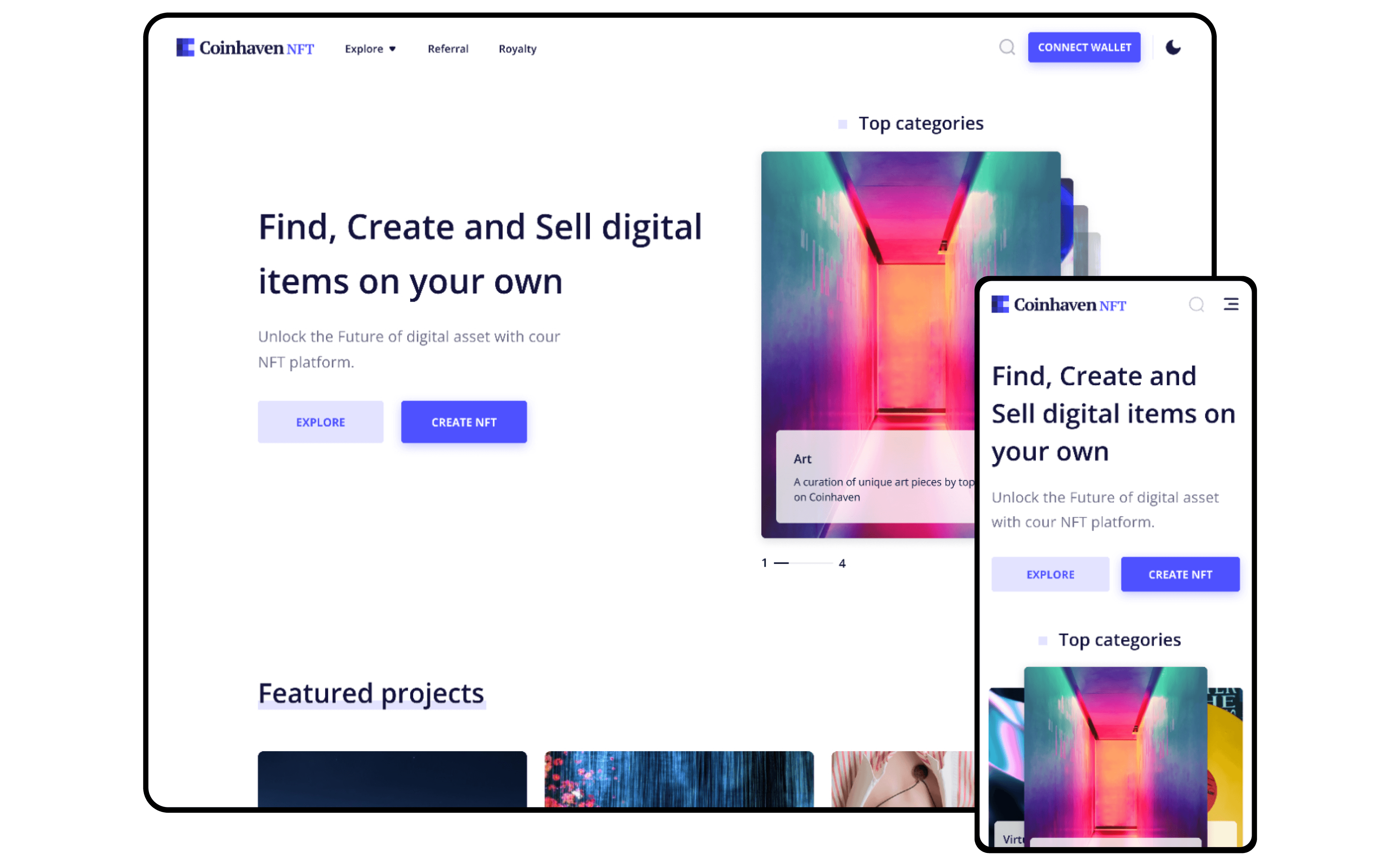
I was brought on as the sole UX designer to build CoinHaven's NFT marketplace from zero. The startup had just shipped a crypto exchange MVP in Germany and wanted to expand into the NFT space, but they had no brand equity, a four-person team, and six months to prove the concept to investors.
My job was to design an experience that made minting, buying, and selling NFTs feel effortless, even for someone who had never touched a wallet. The prototype I delivered became the centrepiece of their pitch deck and helped close a €7M funding round.
My Role
I was the only designer, responsible for end-to-end product design: research, interaction design, visual design, prototyping, and user testing. I reported directly to the CEO and collaborated with 2 engineers and 1 product lead.
Team
1 designer, 2 engineers, 1 PM
Timeline
6 months
Tools
Figma, Maze, Discord, Miro
02
The Opportunity
In 2022, the NFT market was valued at $24 billion with projections toward $80 billion by 2025. But the dominant platforms, OpenSea, Rarible, Magic Eden, were built for crypto natives. Small creators were priced out by Ethereum gas fees, overwhelmed by complexity, and exposed to rampant scams.
CoinHaven saw a gap: build for the 90% of creators who wanted in but couldn't get started. My job was to turn that thesis into a product investors could believe in.
“Everyone was building marketplaces. Nobody was building trust. In a market full of scams, the biggest design problem wasn't usability, it was credibility.”
04
Research: Going Where Creators Live
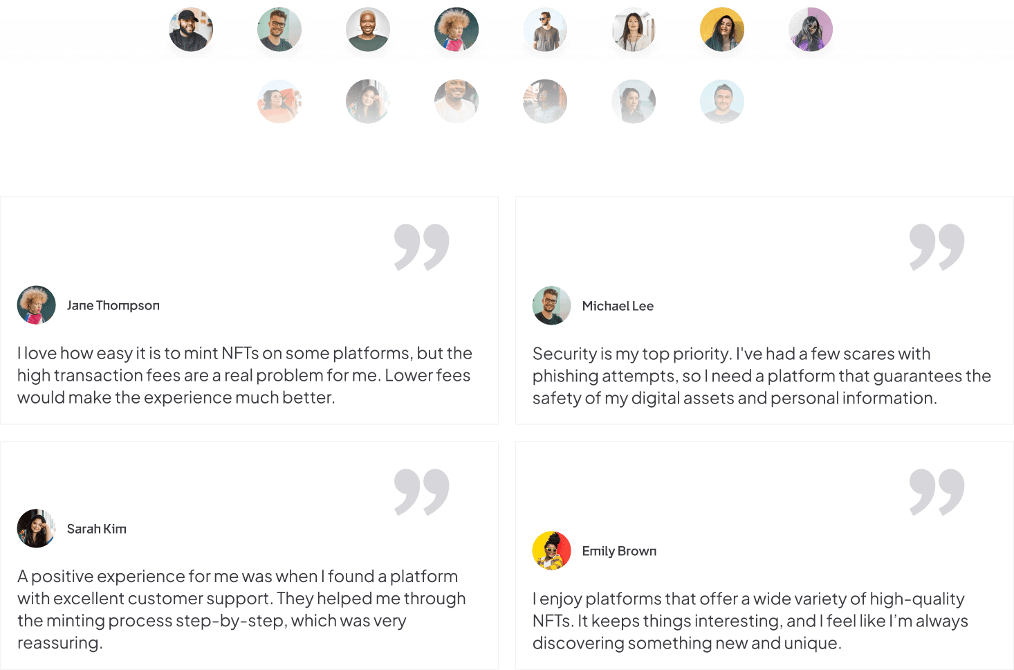
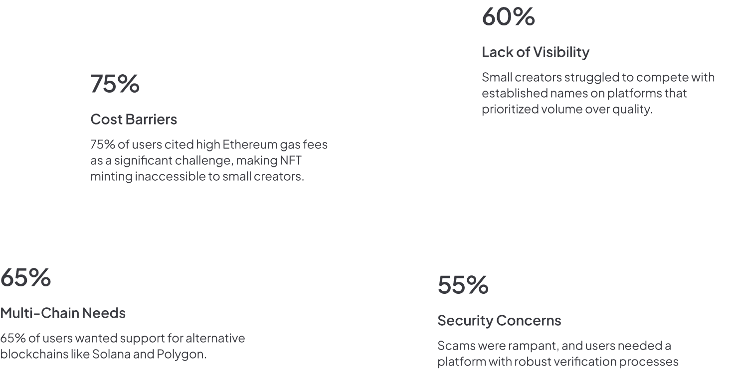
I didn't rely on personas or assumptions. I went to where creators actually were, Twitter, Telegram, Discord, and spent three weeks embedded in their communities. I ran surveys, conducted 1-on-1 interviews, and analysed competitor platforms.
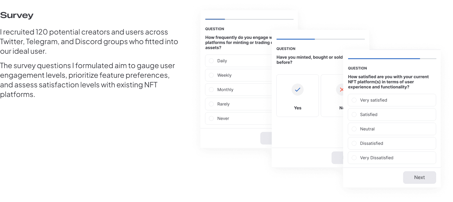
What I heard
High gas fees made minting a gamble. Small creators couldn't compete with established names for visibility. Scams had eroded trust across every platform. Creators wanted pre-launch buzz tools to build an audience before drop day.
What I rejected
The team initially wanted to copy OpenSea's layout. I pushed back, our users weren't crypto natives. I argued for a creation-first flow rather than a trading-first one, and won the debate with research data showing 73% of our target users identified as "creators first, traders second."
05
Competitive Analysis
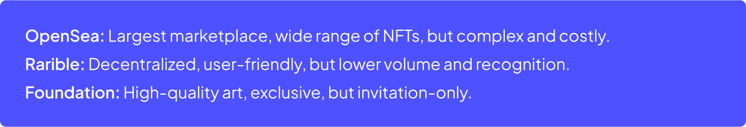
I mapped OpenSea, Magic Eden, and Rarible against creator pain points. The gap was clear: none of them optimised for first-time creators or offered multichain minting to avoid Ethereum's fee problem.
06
Key Findings
Creators dreamed of platforms that were affordable, inclusive, and secure. They wanted tools to build buzz before launch, something that levelled the playing field. This became my design brief.
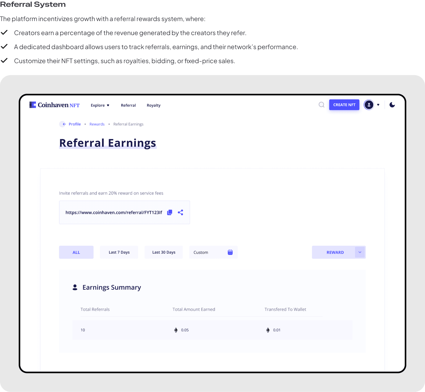
“I chose to design trust signals into every touchpoint before designing a single marketplace feature. Provenance, creator verification, and community proof, not as add-ons, but as architecture.”
08
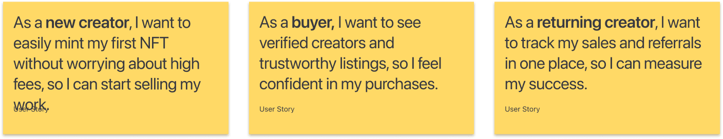
User Stories & Journey
I mapped journeys for three user types: a first-time creator minting their debut NFT, a seasoned artist expanding reach across chains, and a collector looking for verified, scam-free art. One insight drove everything: simplicity was non-negotiable.
09
Interaction Design
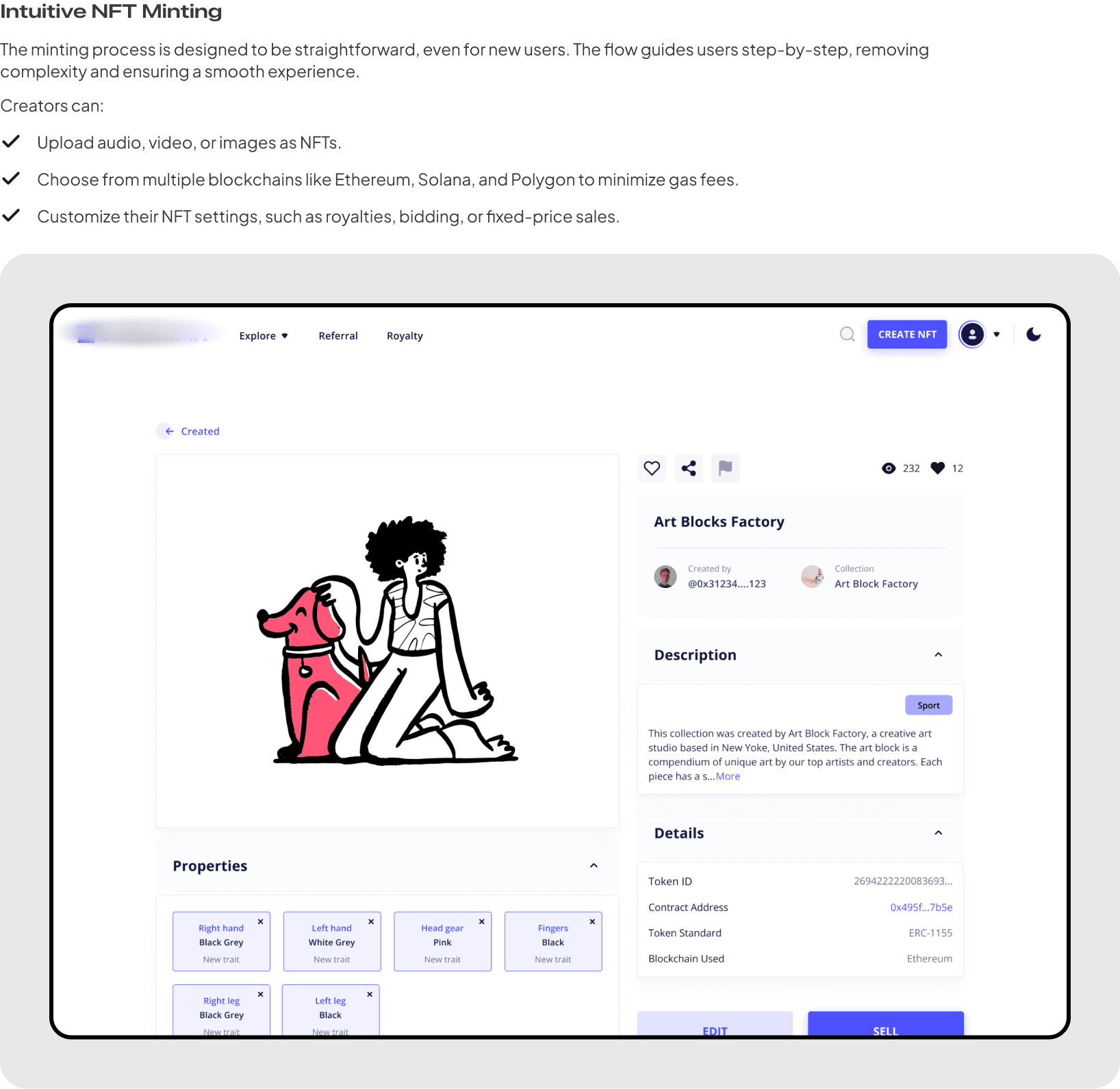
I focused on making every interaction feel like a moment of creation, not a transaction. The minting flow became a digital canvas, upload, choose your chain, customise settings, preview, publish. Three screens. Zero jargon.
10
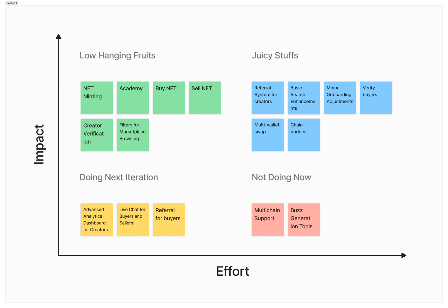
Ideation & Prioritization
I facilitated a workshop with the team to brainstorm and then ruthlessly prioritise. Each idea was scored on user impact vs. engineering effort. We cut 40% of the initial feature list to ship something focused.
11
What I Tried and Killed
I initially designed an elaborate onboarding wizard, wallet setup, profile creation, preferences, community intro, five screens before a user could do anything. Testing showed 60% drop-off by screen 3.
I killed the wizard and replaced it with progressive disclosure: connect wallet → start creating → fill in profile later. Drop-off fell to 15%. The lesson: in Web3, trust is earned by letting people do something, not by asking them to commit upfront.
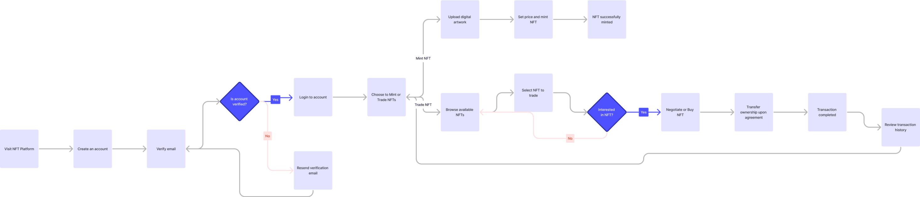
12
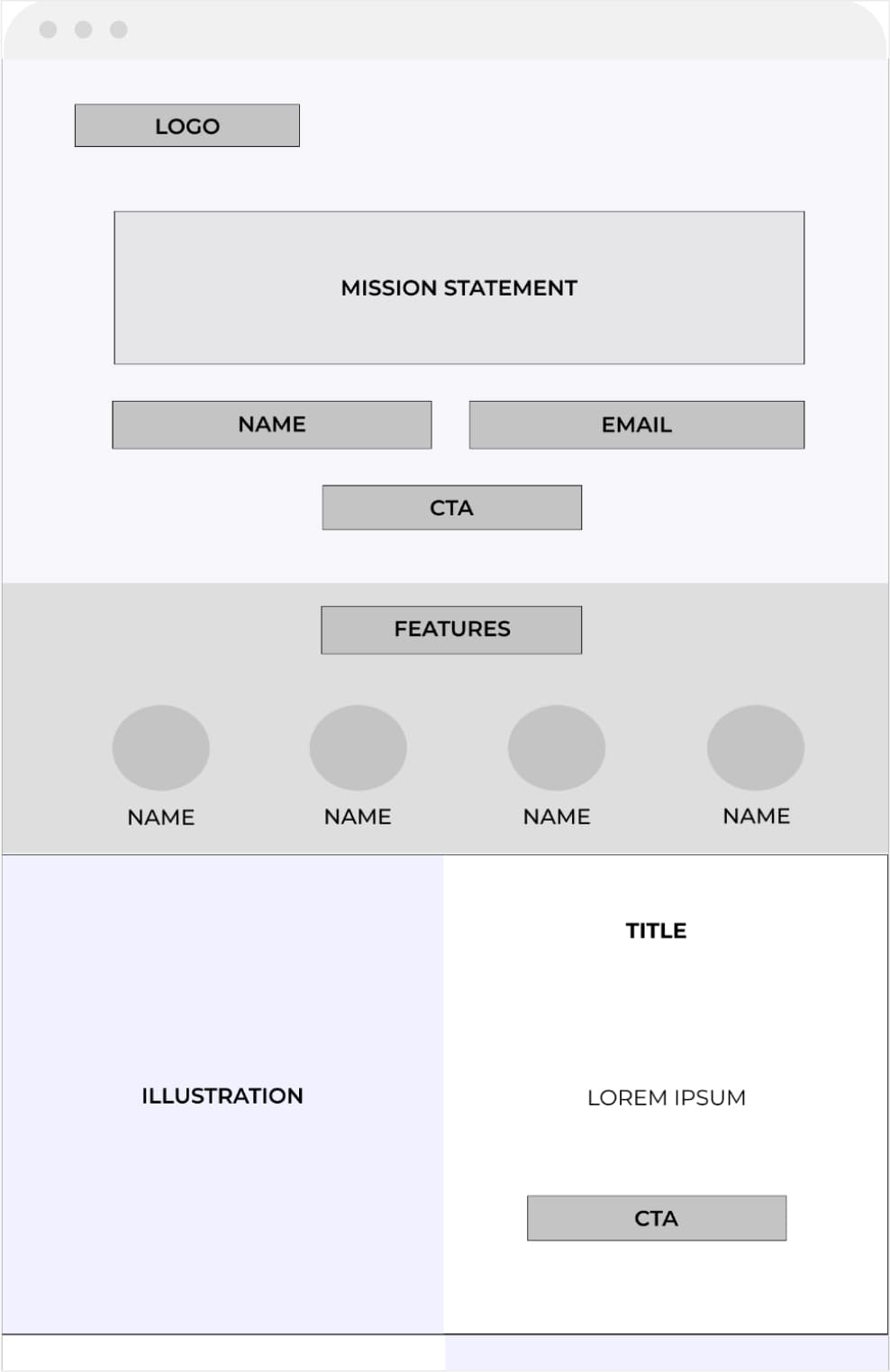
User Flow
13
Sketches & Wireframes
Rapid pen-and-paper iterations before committing to pixels. I tested wireframes in-house first, then with 8 potential users from Discord. Two rounds of iteration before moving to high fidelity.
14
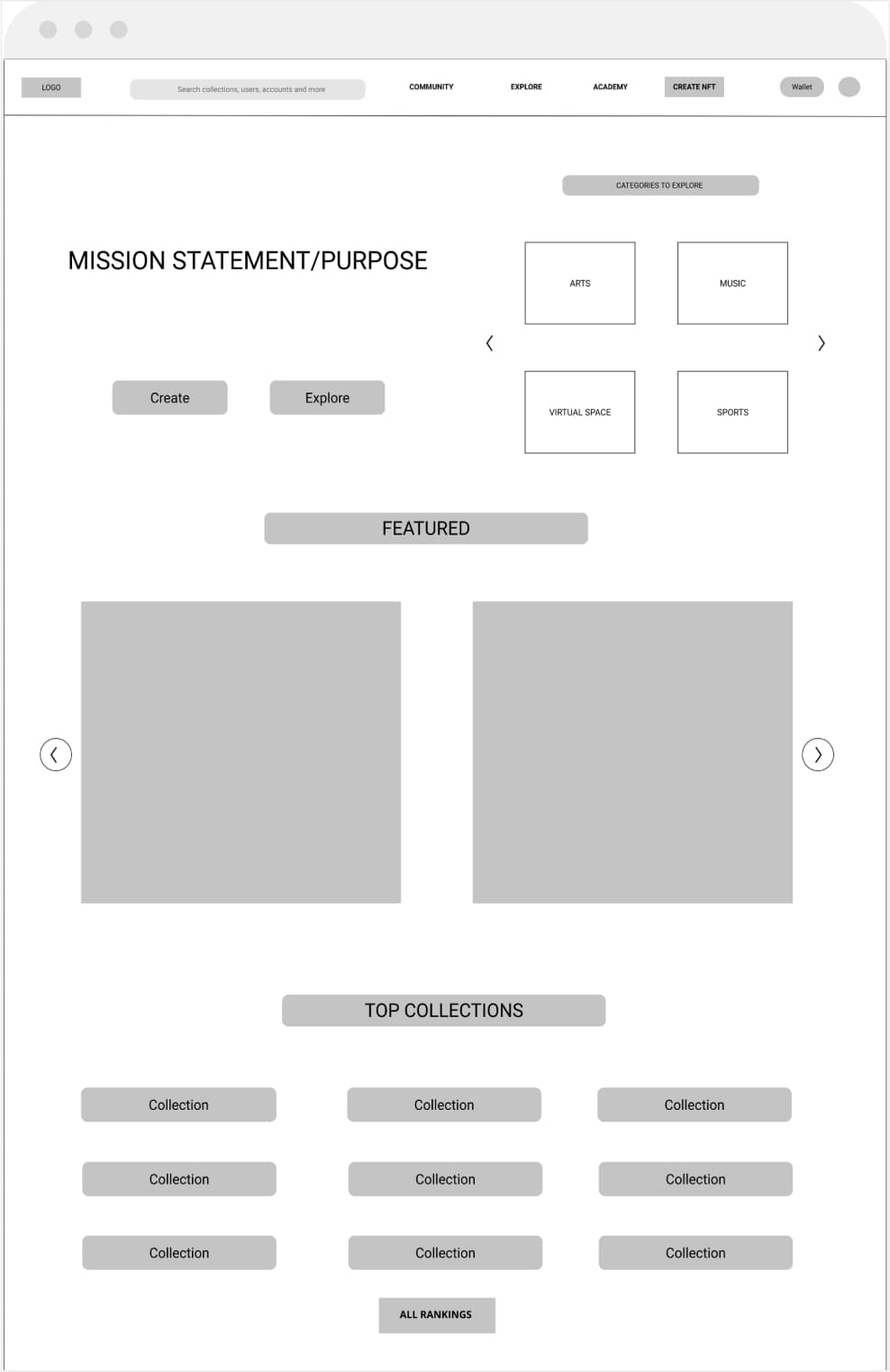
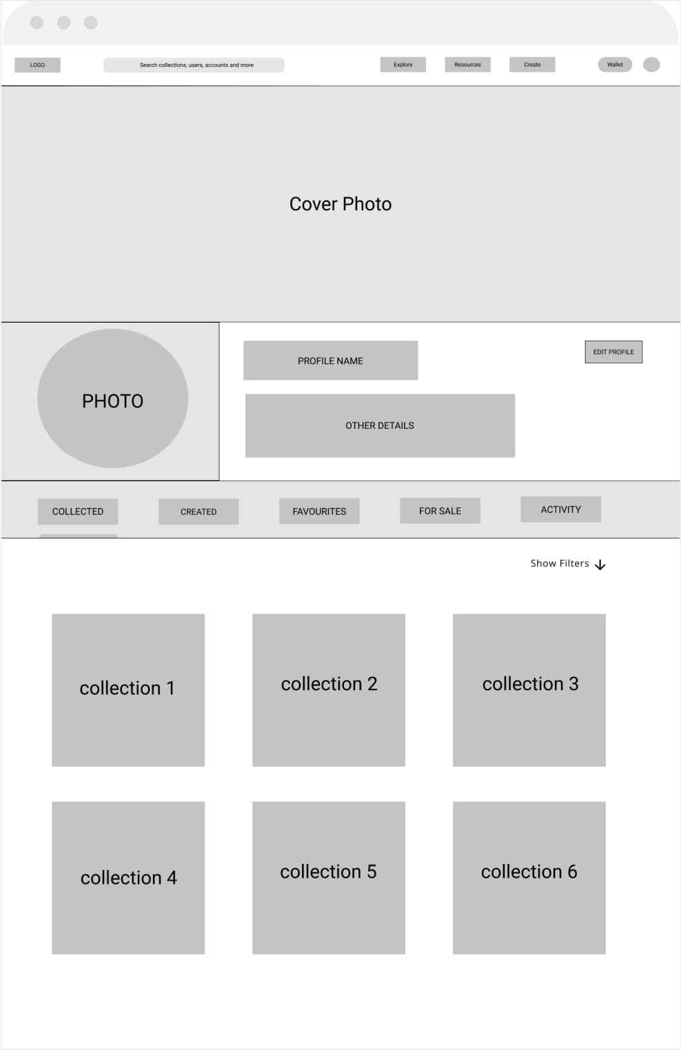
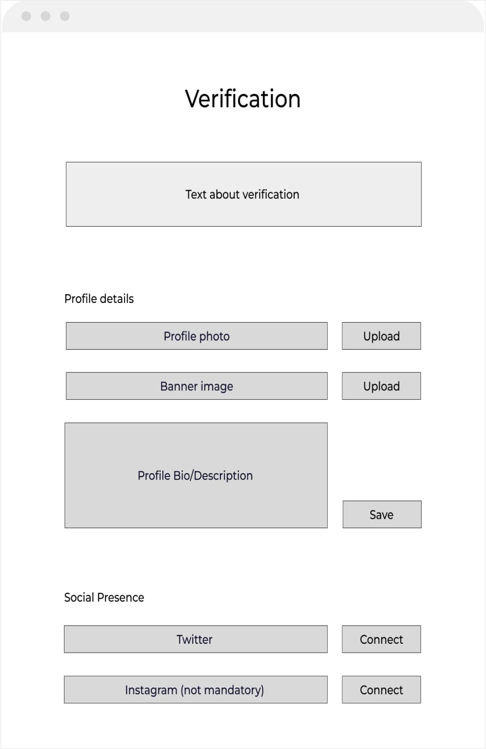
Final Designs
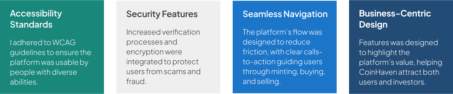
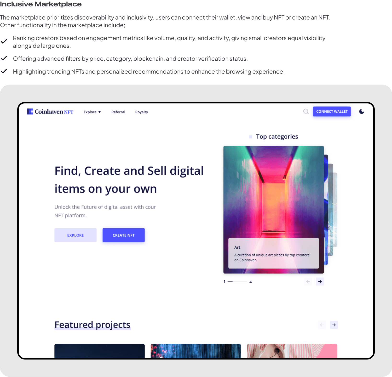
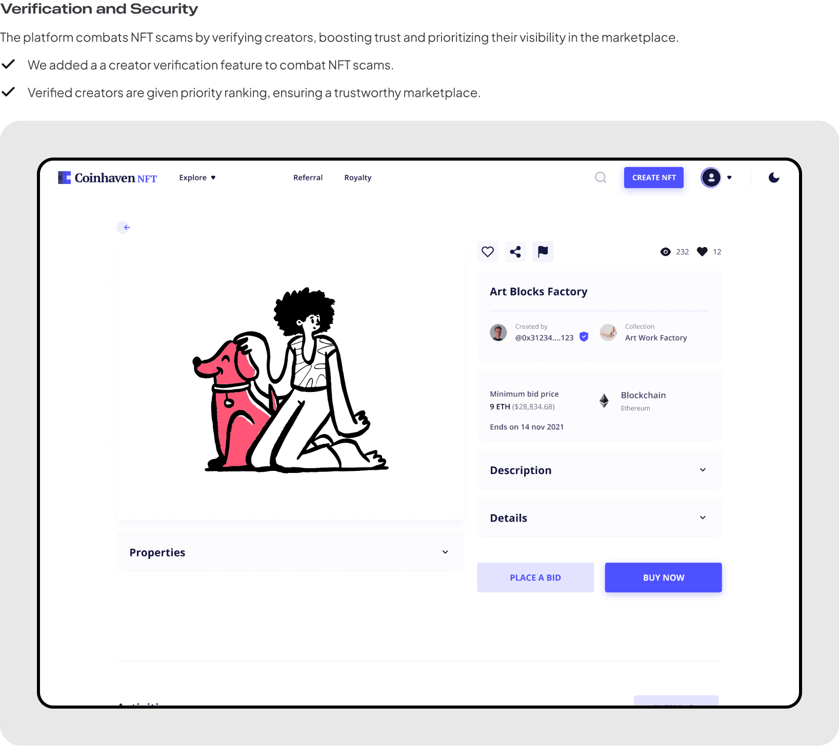
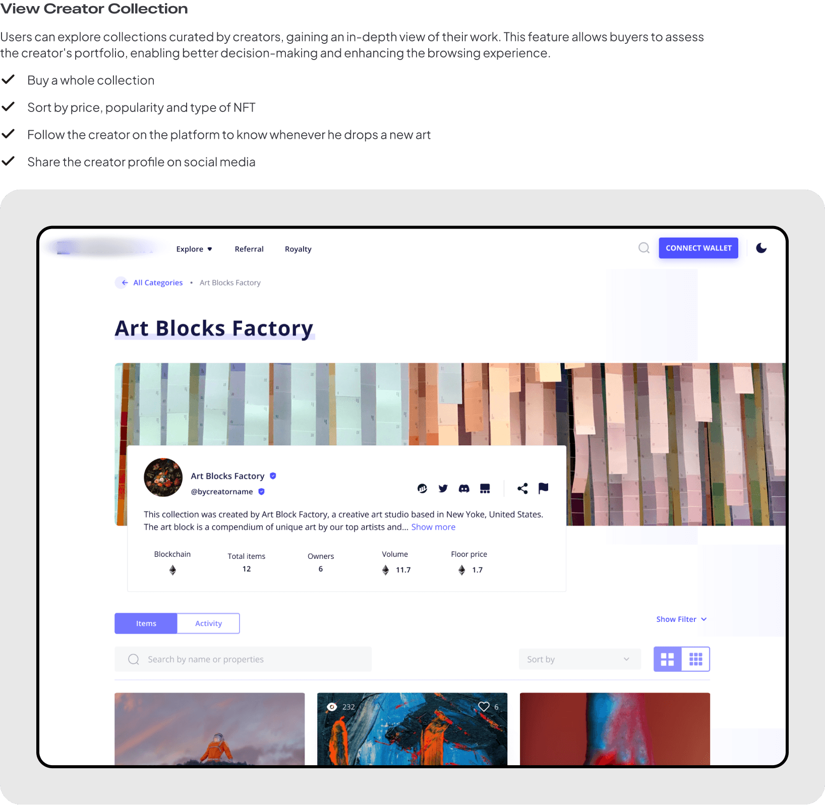
Every screen was designed to tell a story. The minting process became a moment of creation. The marketplace prioritised trust signals, verified badges, provenance history, community endorsements, over flashy visuals.
15
Validation
I tested the prototype with 15 users across three segments. Account setup and purchasing scored highest. Minting had friction around blockchain terminology, I addressed this by replacing jargon with plain-language tooltips and contextual help.
Account Setup
Smooth. One-click wallet connect removed the biggest barrier.
Minting
Terminology was the blocker. I replaced "gas fees" with "network cost" and added inline explanations. Completion rate improved from 54% to 82%.
Listing for Sale
Auction instructions needed clarity. I added a visual step indicator.
Browsing & Purchase
Users loved the filter system and verified creator badges. Purchase flow tested at 90% task success.
Impact
€7M
Funding raised, the prototype was the centrepiece of the investor pitch
60%
Platform usage growth within 6 months of launch
82%
Minting completion rate after terminology redesign (up from 54%)
17
Reflection
The biggest thing I learned: in a zero-trust market, the most important design decision is what you show before asking for anything. Every trust signal I embedded, verified badges, provenance chains, community proof, mattered more than any feature.
If I did it again, I'd push harder for native mobile from day one. The responsive web approach worked but limited engagement patterns. The foundation is there for mobile expansion.
Result
€7M
secured in funding. 40% platform growth in 6 months post-launch.
Trust became the product's primary differentiator in a market where every competitor looked identical.